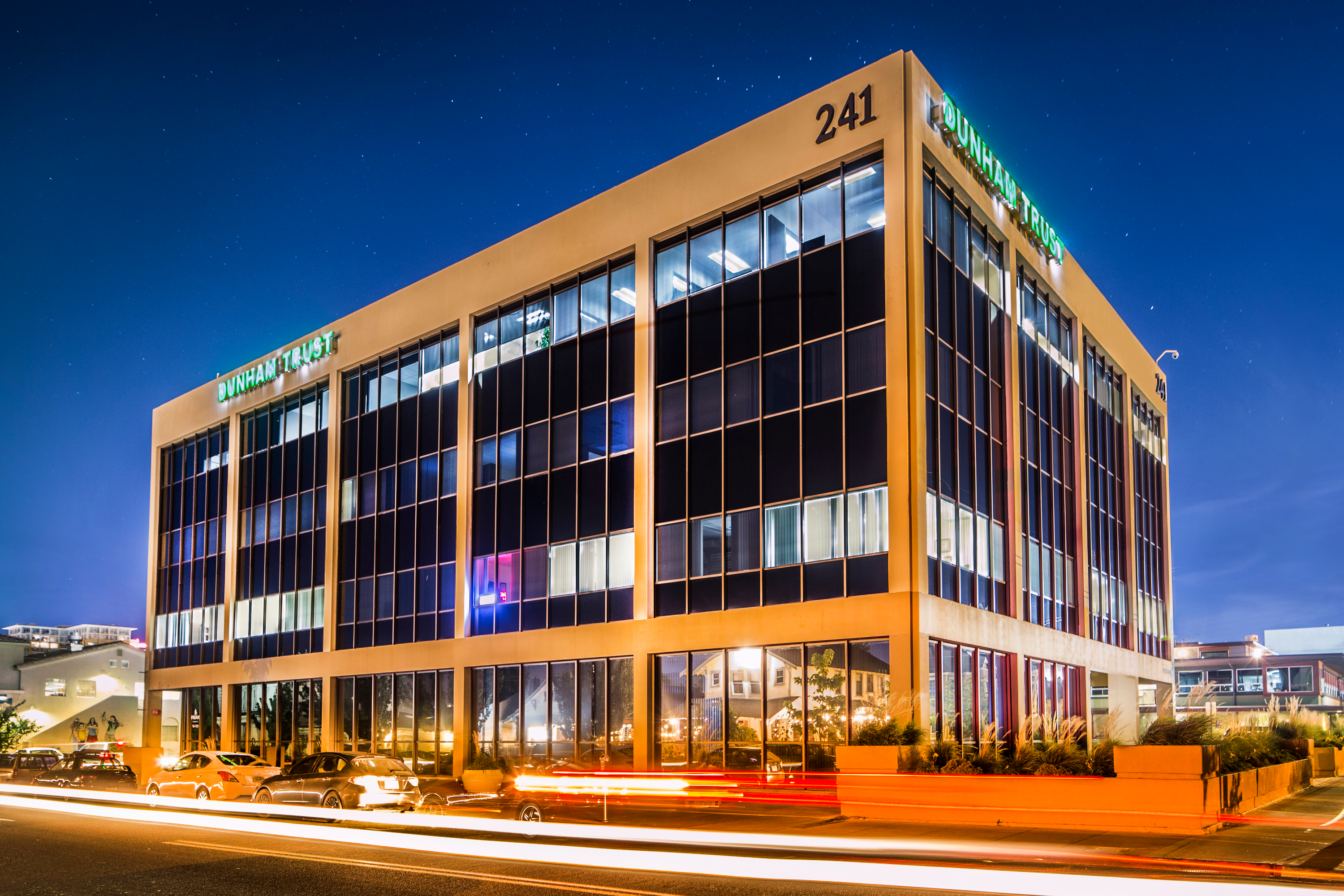
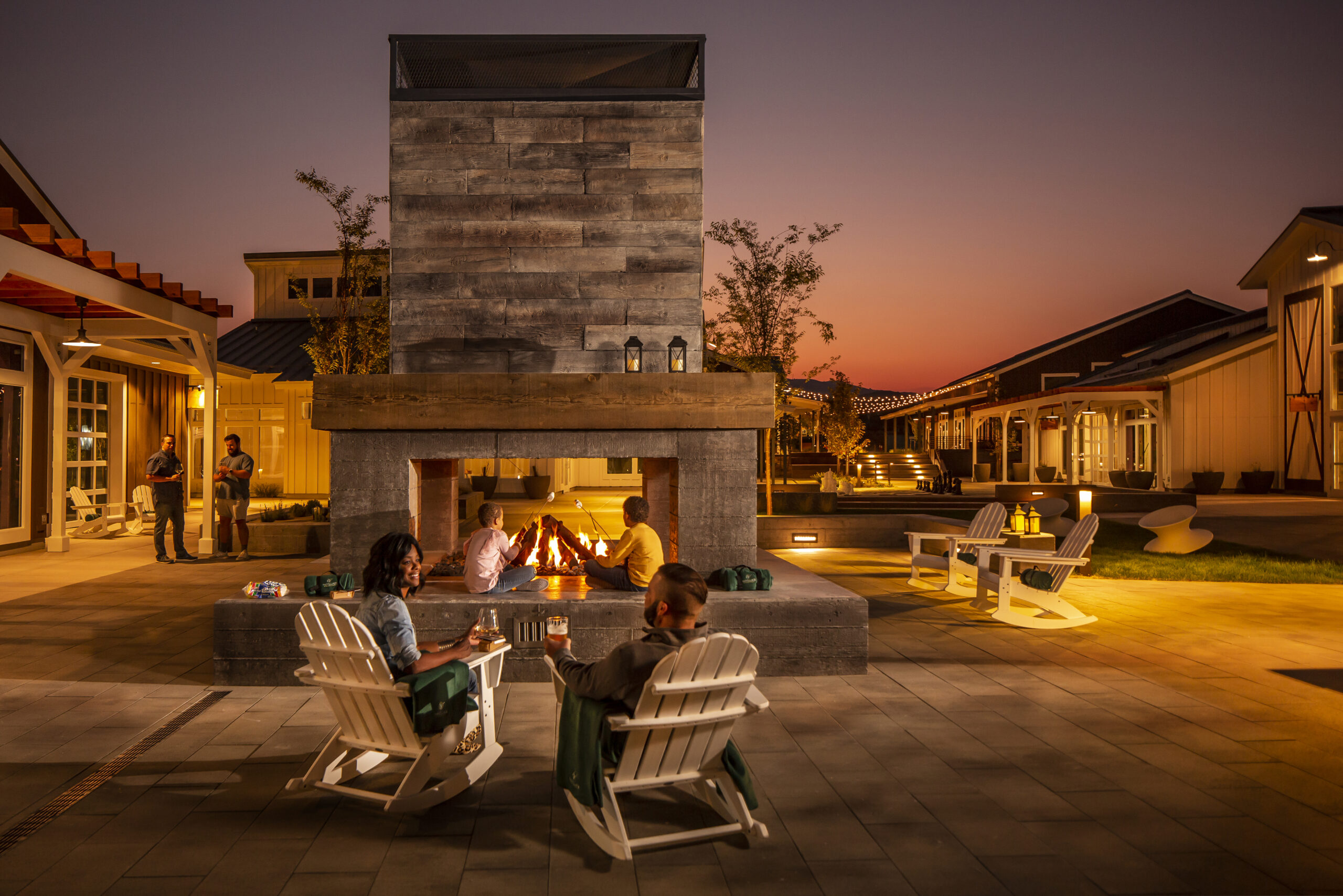
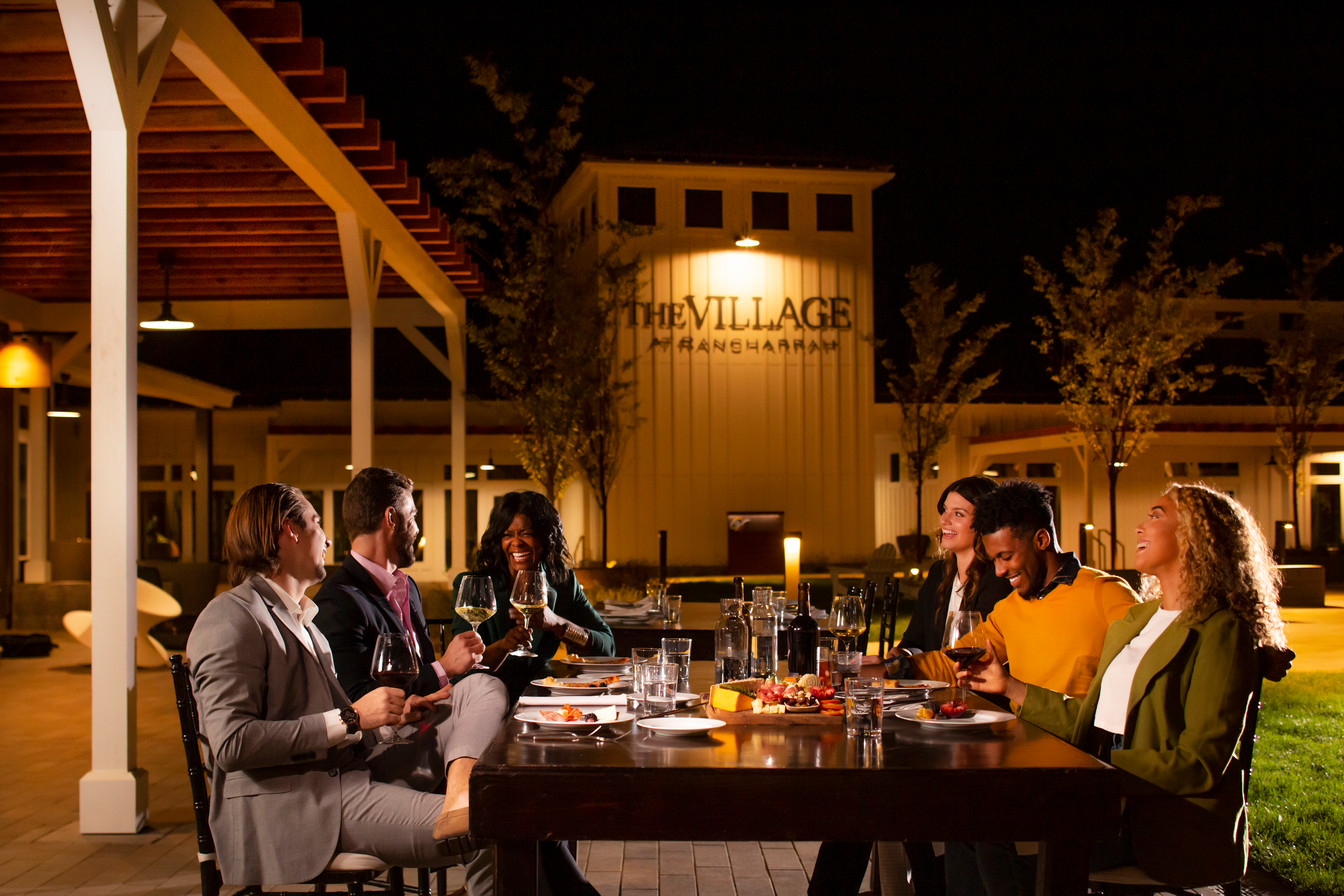
"The response to our new name and brand has been overwhelmingly positive. I feel our new brand will open up new business opportunities and assure current clients that we have our eye on the future. As a result of Stan Can Design's brand development process, our team has a new common confidence and sense of purpose." Erik Fong – Principal Architect, OneStudio D+A
John Doe

The MBA brand had a few problems to be solved, the first being the name itself. The letters “MBA” stood for partners who hadn’t been with the firm for years, which meant the brand had lost much of its meaning and ownership. Additionally, the company’s current partners were restructuring the firm leadership and appointing three key staff members to new partnership positions. They needed a brand that wasn’t tied to any particular individuals but encompassed their unified team approach now and into the future. It was also important to create a sub-brand for their Interior Design division, Identity Design Lab, that could stand alone as well as being easily integrated into business proposals and work flow.
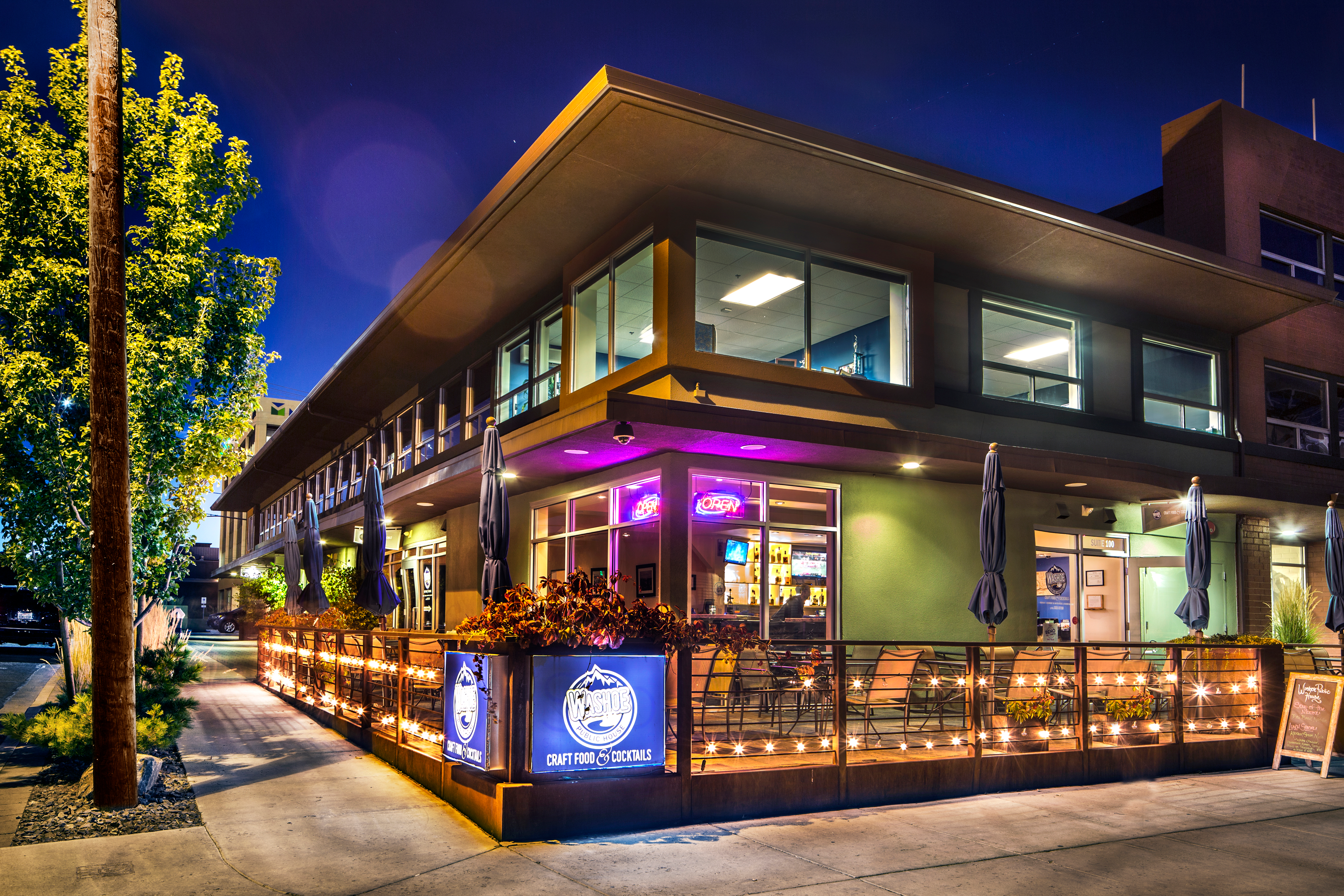
Secondly, the MBA brand was no longer visually representative of the quality of the firm’s product. The firm had gained a reputation for award-winning work that was imaginative, inclusive, and interesting. They truly were pushing the envelope in designing the spaces in which we work, play, and live. Compared to their work, the company’s logo felt outdated and tried to do too much without actually communicating the firm’s unique approach to design.
As part of our insightOUT™ Brand Development process, we poured over dozens of pages from notes and hours of meetings recordings to distill everything into the key insights that would form a new brand. In that process we learned a lot of things:
– The firm values collaboration, not just amongst each other, but with clients and third party contractors.
– They stress the importance of architecture and interior design working together towards a common goal.
– The team forms deep understandings of the purpose and people behind each project. They call this “finding the ‘why?’”
We distilled everything we learned from our brand discovery process and came to the conclusion that connection is the single most important aspect of the OneStudio D+A brand. It’s apparent in the team’s penchant for constant collaboration, always coming together towards a common goal. It shows in OneStudio D+A’s process of combining architecture, interiors, and other disciplines of design to achieve the best results. When OneStudio D+A asks “why?” at the start of projects, they are establishing a deeper connection to their client’s vision. And by doing that, they’re taking the first step in designing spaces that better connect with the people who will use them, which in turn creates more connected communities wherever their company goes. When the client suggested the names OneStudio D+A and Identity Design Lab, it was an easy decision to march forward with them.
Designing two logos at the same time, both with interesting names, can be quite a challenge. Every change in the design process affected the other in unexpected ways. The mathematics to create the OneStudio background pattern had to be extremely precise to create a pattern that works in every direction.
We love how the negative spaces in the logotype connect the various pieces of the letter forms together. To us, it speaks to the brand pillars of connection and unity. Once-in-a-lifetime, the ONE logo will create a pattern that is perfectly symmetrical and it gets the little designer in us all giddy. The logo is flexible and versatile enough to be displayed either horizontal or vertically. We slightly rounded the corners on all of the letterforms to soften the edges and unify the logotypes.
Initially, an earlier version of the logo had been approved and prototyped. The client came back and asked for some revisions to that version of the logo that made the work much better. Instead of telling us what to do, they explained what they thought wasn’t working and we came back with a much better solution.
Building blocks, the work of Michael Vanderbyl, and The Holy Trinity of circle, square, and triangle.
This project lingered a bit waiting for legal approvals on naming and other industry certifications, totaling nine months to completion.
The client understood that trying to create traditional logos in the style of icons or illustrations was pedestrian, so we were able to focus on forms that expressed and celebrated the names themselves.
The design system relies on the typeface Avenir Next by Adrian Frutiger. Avenir is a geometric sans-serif typeface designed by Adrian Frutiger in 1987 and released in 1988 by Linotype GmbH. The word “avenir” is French for “future”. It is also notable the ease that this system is able to occupy spaces because the pattern and logo work so well with each other.
Check out more featured projects.